Clear category navigation
Top-level product categories help shoppers start browsing without having to interpret a complex menu.
A fashion ecommerce website review focused on brand storytelling, collection discovery and a clean path from inspiration to product browsing.
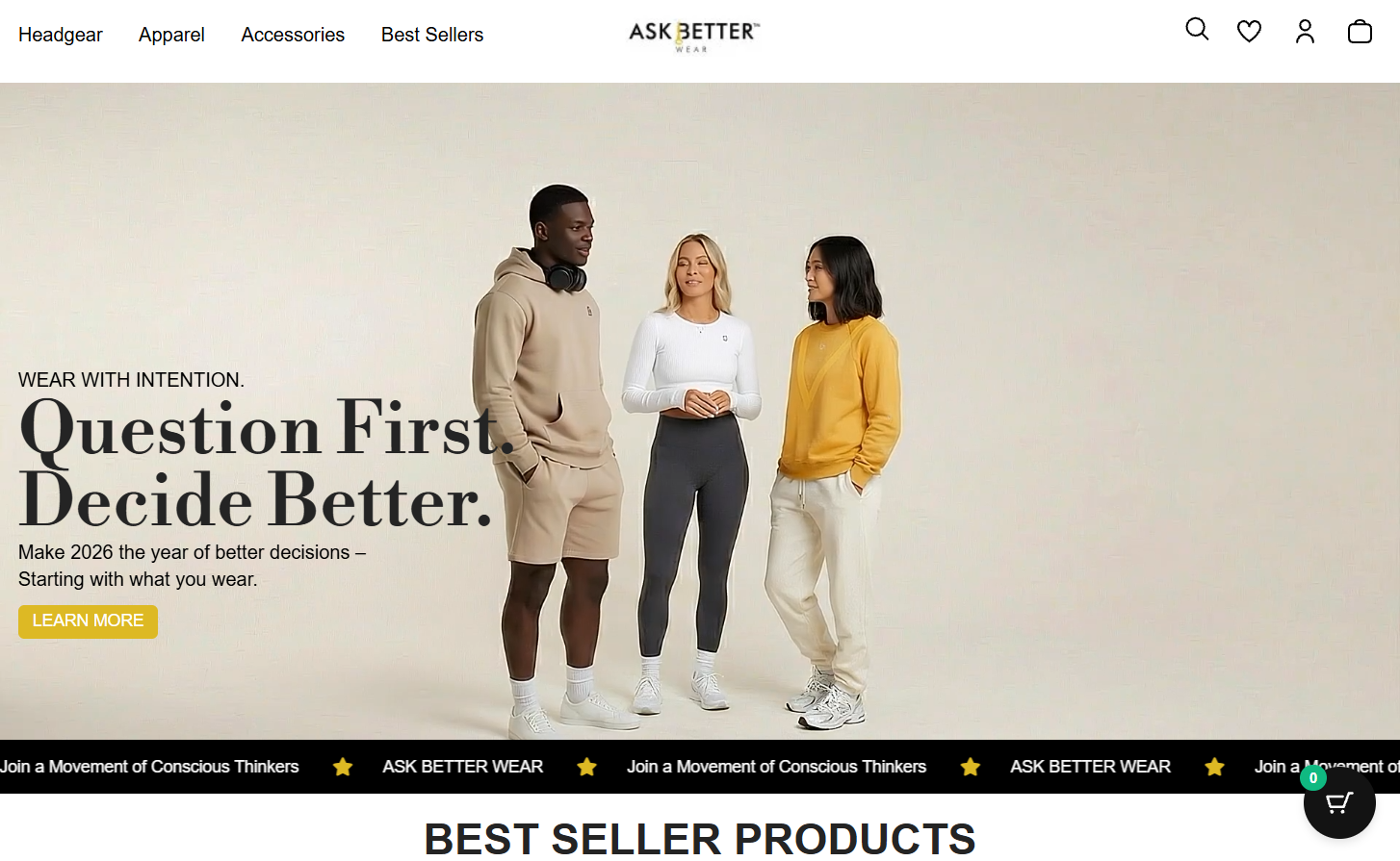
The supplied ASK BETTER WEAR homepage uses a restrained header, centered wordmark and large lifestyle campaign image to establish a considered fashion identity. Category navigation keeps Headgear, Apparel, Accessories and Best Sellers easy to find, while utility icons provide familiar routes to search, saved items, account and bag.
The hero combines the message “Wear with intention” with a strong editorial headline and a Learn More action. A moving brand message strip then leads into the best-seller section, connecting brand philosophy with product discovery.
Top-level product categories help shoppers start browsing without having to interpret a complex menu.
The large lifestyle hero creates a strong first impression and gives the brand philosophy a central role in the storefront.
Search, wishlist, account and bag icons place common ecommerce actions where returning shoppers expect them.
Meet the brand through its campaign image and point of view.
Choose a category or move toward best sellers.
Review product imagery, details, sizing and price.
Add the chosen item to the bag and continue checkout.
Use a direct, descriptive CTA such as “Explore the collection” when it better communicates where the visitor will go.
Keep sizing, fit, fabric, shipping and returns information easy to find on product pages.
Check navigation, image crop, campaign text, product cards and cart actions on common mobile screens.
Track collection clicks, product views, add-to-cart actions and checkout completion to identify where shoppers need help.
Portfolio disclosure: this is a design review based on the supplied screenshot and public website reference. No client relationship, implementation work or sales/conversion results are claimed.
Autrivon brings strategy, creative thinking and technology together to build clearer digital customer experiences.
Book a strategy call ↗